We’ve just used SurveyMonkey audience and we loved it. Here’s why.
One of our newest clients, Smith Global, an engineering consultancy based in Gympie, has a proud 118-year history of designing and manufacturing transport equipment for Australian conditions.
Smith Global is a streamlined incarnation of the J Smith and Sons trailer manufacturing business, focusing on engineering consultancy. The Global Financial Crisis combined with the 2010 mining downturn and rising competition from cheap overseas-made trailers spelt the end of the line for the previous company and the workforce shrank from well over 100 to just 6 staff in the new entity, Smith Global, around 2012.

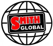
The Smith Global logo was derived from the J Smith and Sons logo and carried much of the same design elements. The wireframe globe, the bordered Smith and the offset nature of the “Smith” in the logo were all taken from the prior entity.
When we began working with Smith Global in late 2017, one of the first things that was apparent was that we were going to have to produce new marketing collateral like a renovated website, new brochures and new promotional gear to grow the business. It was the right time to evaluate if the logo was doing the job it was supposed to.
The client wasn’t convinced that the logo needed to change. To their way of thinking, it was the result of a relatively recent project and they could name several competitors that had logos that were clearly older and less professional – the Smith Global logo was clearly better than those, so did they really need to change?
We were convinced an update was required, but we were coming from a biased position. How could we get some relatively independent opinions on the topic?
Enter Surveymonkey Audience, an easy-to-use panel survey tool that allows you to take advantage of a worldwide panel of respondents ready to offer feedback on any survey topic you can think of.
We took the Smith Global logo and put it up against a couple of competitors’ logos, asking our audience for a range of feedback, from their impressions of which logo looked like it represented a company with more technical expertise, which looked more professional, fresher etc.
We had our results inside 4 hours, from starting the compilation of the survey to looking at the automatically analysed results.
The market panel had nearly unanimously backed our conviction that the logo needed a freshening before we engaged in the other creative activity.
The client saw the independent feedback and immediately commissioned a new logo development process.
SurveyMonkey Audience took a potential obstacle to progress and removed it in 4 hours and $150. That’s excellent value for money. We recommend it.
To talk to us regarding your marketing needs please contact us on 1300 36 20 27 or fill in the form on this page.
Topics:


